The two Victorian based Australian Junior Ice Hockey League clubs – Melbourne Glaciers and Melbourne Whalers – continued their build up to the upcoming AJIHL season, by releasing club logos, colours and jersey designs.
Designs for each club were released via their official club Facebook pages, which has been a move which should pay great dividends for each club as they look to expand and broaden their appeal to the hockey community.
Along with the Facebook pages for each club, came two Twitter accounts which will also keep hockey fans informed across that social media platform.
It’s a terrific step forward in the re-branding of the AJIHL based Victorian teams, hockey and sports fans are constantly looking for increased access to their favourite clubs, the move to have two social media accounts for each will allow new and old hockey fans the ability to interact and build supporter enthusiasm.

Looking forward with the two clubs internet presence looks to be taking shape well, hopefully, we see individual websites for each club in due course.
When looking at the designs released by both clubs my initial reaction to the designs is that of satisfaction, both clubs looked to have invested well in the design and appeal that all logos, colours and jersey designs need.
Melbourne Glaciers have gone with a red, black and silver design. The clubs logo incorporates a mountain, ice glacier and a hockey puck, a second logo which will be placed and the back of each jersey, will commemorate the Melbourne Glaciarium built in 1906. The logo has two ice axes that cross over each other in keeping with the Glacier theme.
The logos, colours and jersey design all fit in nicely and the added touch of the Glaciarium logo will connect well with the Melbourne hockey community. I really like this design and look from the Glaciers, I think it has been thought out well and will look terrific out on the ice.

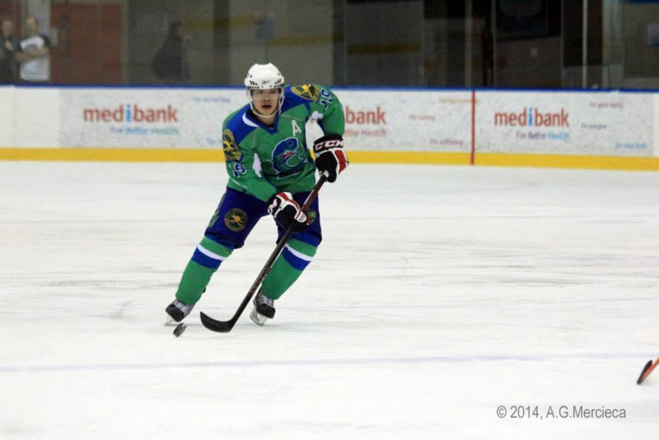
Melbourne Whalers have opted for the more traditional blue and green that is associated with the Whalers name. The clubs logo has a fierce looking Whale and an addition of a puck to create the illusion of the mammals blow hole, which is a great little touch.
The Whalers name is also written below and brings to life the whales tail as it is part of and extension to the letter W, it’s a fantastic piece of design work.
When looking at the jersey design, however, I find the green on the jersey to be over excessive and very bright. While the green colour may look to be a lot more than probably needs be, until we can get a look at each jersey in finished production, I won’t be jumping to any conclusions, they still get a big tick from me.
Along with the club logos, colours and jersey designs came the announcement of each teams roster for the upcoming AJIHL season. Stay tuned to On the Fly Hockey as we bring you a run down on each squad in the coming weeks.
In the mean time, head over to the Melbourne Glaciers and Melbourne Whalers Facebook pages to check the full design release.
You can also follow both the Glaciers and Whalers on Twitter.


Leave a Reply